

Better Data Visualizations Book
$16 $28
Size
Posh Protect: Buyer Protection Policy
Get your order as described or receive your money back. Learn More.
Shipping/Discount
Like and save for later
Add To Bundle
**Brand New**
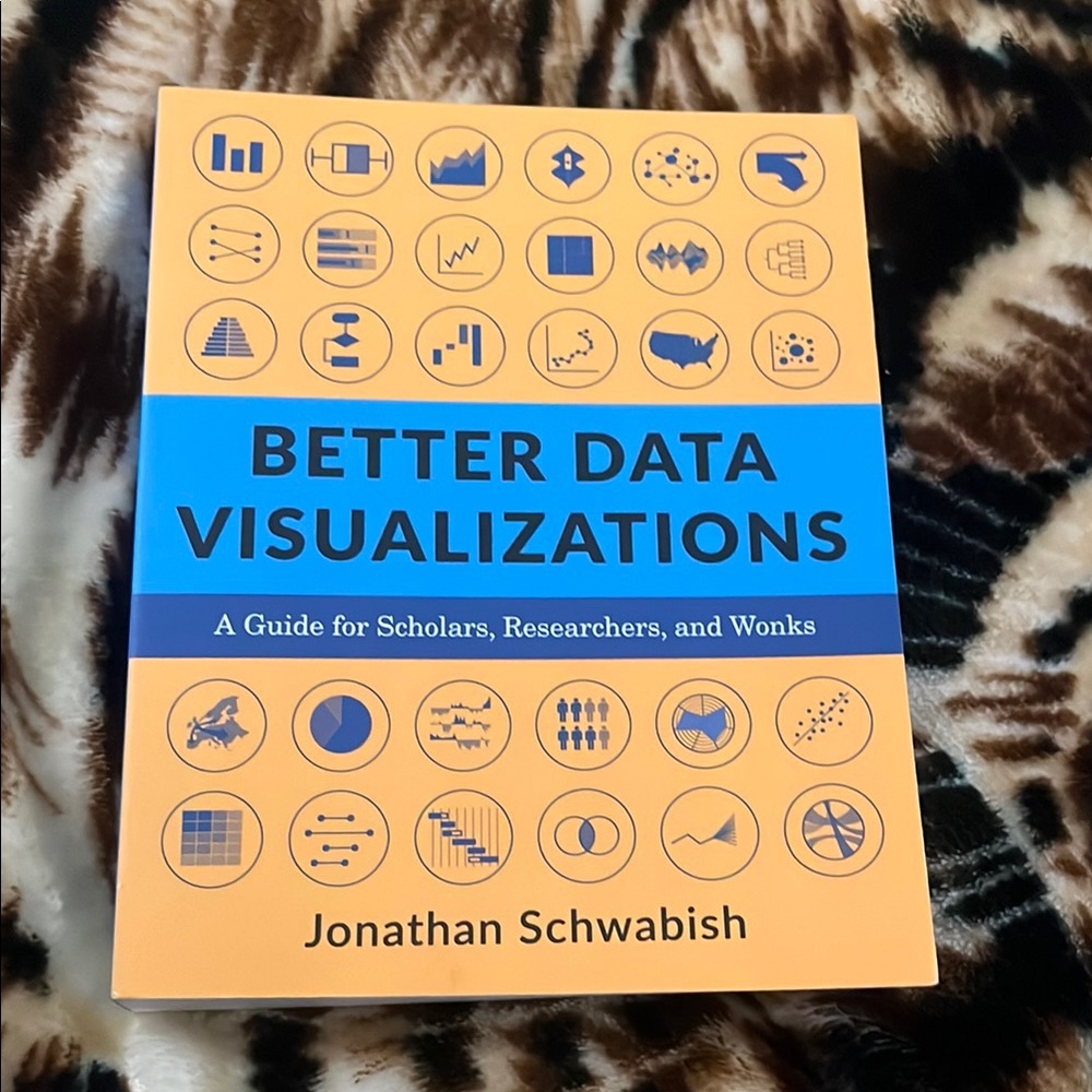
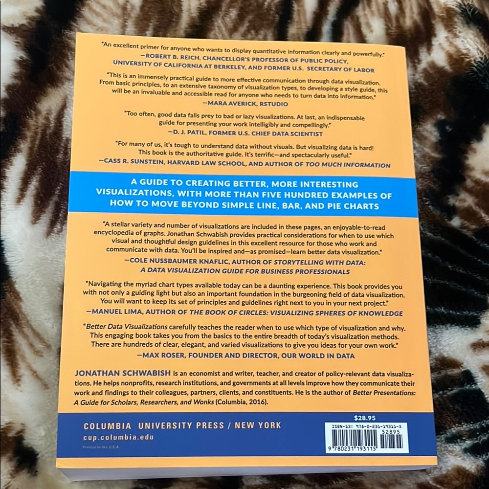
Now more than ever, content must be visual if it is to travel far. Readers everywhere are overwhelmed with a flow of data, news, and text. Visuals can cut through the noise and make it easier for readers to recognize and recall information. Yet many researchers were never taught how to present their work visually.
This book details essential strategies to create more effective data visualizations. Jonathan Schwabish walks readers through the steps of creating better graphs and how to move beyond simple line, bar, and pie charts. Through more than five hundred examples, he demonstrates the do’s and don’ts of data visualization, the principles of visual perception, and how to make subjective style decisions around a chart’s design. Schwabish surveys more than eighty visualization types, from histograms to horizon charts, ridgeline plots to choropleth maps, and explains how each has its place in the visual toolkit. It might seem intimidating, but everyone can learn how to create compelling, effective data visualizations. This book will guide you as you define your audience and goals, choose the graph that best fits for your data, and clearly communicate your message.


chicntrendy1
and
one other
like this


Find Similar Listings

@orchid_sun
View Closet
Last Active: hours ago
44
Listings20+
Sold Listings1 day
Avg. Ship time2
Love Notes@orchid_sun
View Closet
Last Active: hours ago
44
Listings20+
Sold Listings1 day
Avg. Ship time2
Love Notes
Account is under Review
Comment posting is temporarily restricted. Our team will reach out to you shortly. To understand why, select
Learn More.
Still Selling This?
Yes, this item is still for sale.
I don’t want to sell this item right now.
I no longer have this item.
Delete Listing?
This action cannot be undone. You will no longer see this listing in your closet and your account will not be affected.
